Table Of Contents

Why Use Label Colors?
When it comes to safeguarding your organization’s data, color speaks volumes. Imagine a world where a simple hue can instantly convey a document’s or email’s importance. Well, that world exists, and it’s right within your reach—thanks to label colors in sensitivity labels. Now, let’s explore why these vibrant markers matter and how you can wield them effectively. 🌈🔒
Improved Visibility: Different colors for different sensitivity levels allow users to quickly identify the level of protection applied to a message or file. Imagine a big red label on a document—users instinctively know it’s more important than a yellow-labeled one. Color coding achieves the same effect digitally.
Increased Awareness: When users see a specific color, they understand the importance of the content and take necessary precautions.
Enhanced Usability: Using colors to differentiate sensitivity labels makes it easier for users to apply the correct label. This reduces the risk of mislabeling and increases accuracy in data protection.
Consistent Labeling: When everyone in an organization follows the same color coding system, it ensures consistent labeling across the board. Consistency reduces misunderstandings and improves overall security posture.
Improved Productivity: Color coding helps users identify and handle sensitive information more efficiently. It reduces the time spent searching for or redacting sensitive content.
How to Set Up Label Colors
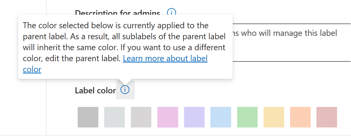
It’s important to note that label colors can only be assigned to parent labels within your sensitivity label hierarchy. The sublabels will inherit the same color as the parent. This ensures that the color-coding system remains clear and consistent across your organization’s documents and emails.

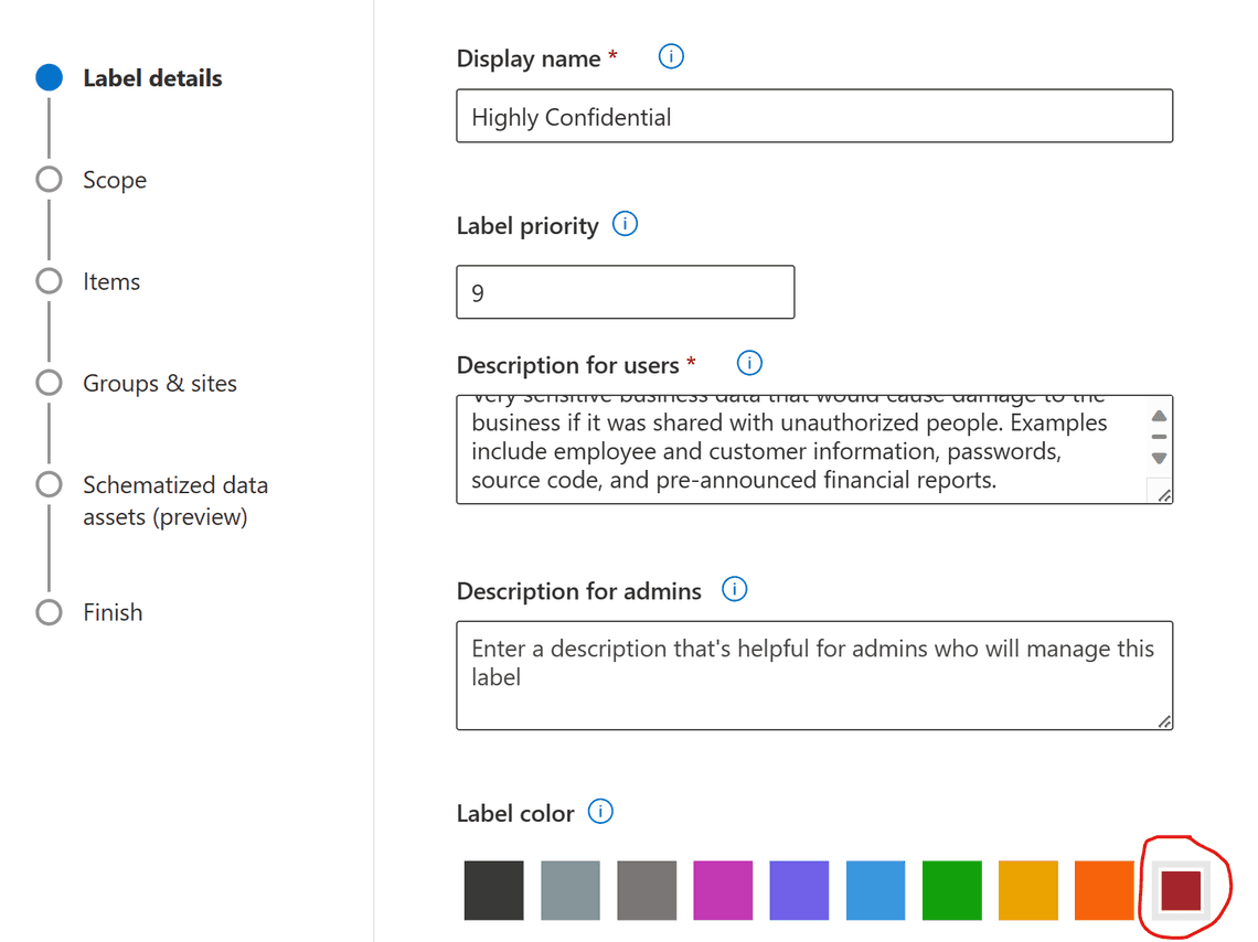
When using the Microsoft Purview compliance portal, you can select one of 10 standard colors for sensitivity labels. The Label color configuration is on the first page of the label configuration after the label name and description. However, you can’t use the compliance portal to configure a different custom color. Instead, we resort to PowerShell.
Using the UI (Microsoft Purview):
- Log in to Microsoft Purview.
- Navigate to Sensitivity labels and select the label you want to modify.
- Look for the color options and choose the one that best represents the label’s sensitivity level.
- Save your changes.

Via PowerShell:
Before you can make changes, you need to run the following commands in PowerShell to install and import the Exchange Online PS Module:
Install-Module ExchangeOnlineManagementImport-Module ExchangeOnlineManagement
This example connects to Microsoft Purview PowerShell in a Microsoft 365 organization:
Connect-IPPSSession
You can use the advanced settings to set a color for a sensitivity label. This configuration supports colors that you can’t configure in the Microsoft Purview compliance portal.
Custom or standard color? To specify your choice of color, use a hex triplet code for the red, green, and blue (RGB) components of the color. For example, #A4262C is the Burgundy we previously set, and #40e0d0 is Turquoise.
Set-Label -Identity "Highly Confidential" -AdvancedSettings @{color="#40e0d0"}
If a label is configured for a different color from one of the 10 default colors, you see a Use previously assigned custom color checkbox selected, and the standard color options aren’t available. You can change the custom color to one of the standard colors by first clearing the checkbox, and then you can select one of the standard colors.

It looks similar for a sublabel, but we can’t uncheck the checkbox:

Remember that label colors are now available in Microsoft 365 apps, making it easier for users to see and understand the importance of their content. Whether you choose lavender, marigold, or charcoal, these colors enhance security, efficiency, and productivity.
Feel free to explore the Microsoft Learn documentation on sensitivity labels for more details! 😊
Thank you for reading
/Simon


